
A crash course in colour: how you can use basic colour principles in your next digital project
Making digital content look good is the goal of many online creators. But is there a way we can better use basic colour principles to engage with our audience?

Sometimes it is easy to overlook how small things like colour might be affecting how many people clicked on our newest creative projects.
It’s no secret in the professional design world that colour should be used carefully and with purpose.
Whether we’re designing a podcast thumbnail or publishing our first article, what are some colour theory basics we can use to help attract our target audience to our content?
Let’s start with colour associations.
Depending on context, many people argue that there are emotional and psychological associations humans attach to different colours on the colour wheel.
For example, the Office of National Statistics gives guidance on what colours to use when visualising data. According to their website, they argue that certain colours have meaning associated with them that is dependent on cultural context.
Their website states: “You need to be aware of colour association with potentially sensitive topics, for example, political parties. The use of a particular colour can change the context of what you are presenting.”
So what are some stereotypical colour associations?
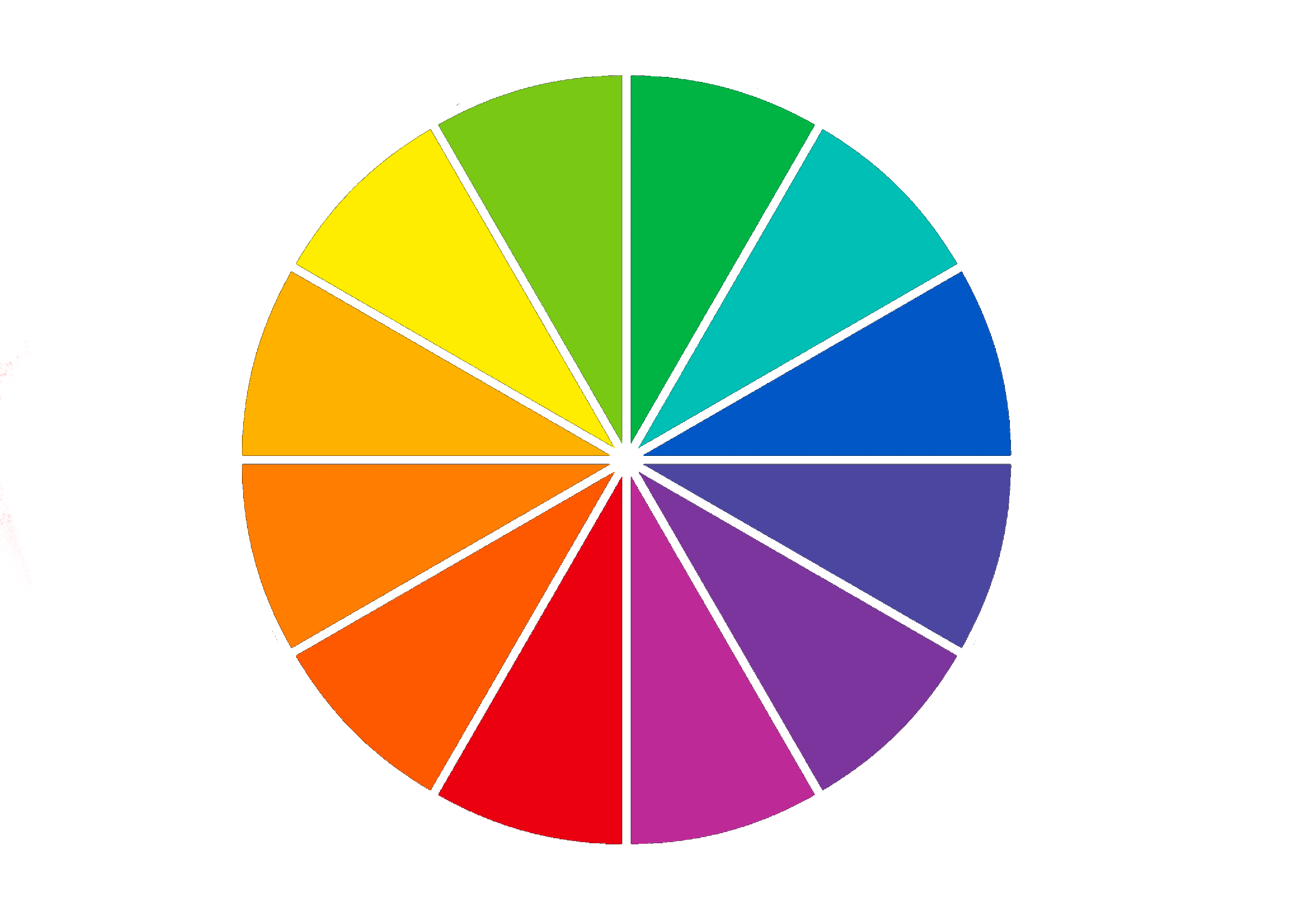
Looking across a few websites, these are a compiled list of ‘associations’ for each colour.
Red: anger, negativity, love, heat, warning, danger, courage, activity, passion and joy.
Orange: brightness, vibrance, happiness, energy, youthfulness, success, anticipation, warmth, autumn.
Yellow: optimism, energy, joy, friendship, intellect, danger, illness, betrayal, youth, fun, caution, egotism, cowardice.
Green: nature, sustainability, veganism, calmness, positive, success, natural, money, envy, luck.
o Think of the ‘greenwashing’ concept. ‘Greenwashing’ refers to a form of marketing where companies deceptively paint an eco-friendly and sustainable image to better promote their brand.
Blue: intelligence, stability, trust, professionalism, freedom, imagination, inspiration, coolness, unfriendliness.
o Is it a coincidence that a lot of tech companies use the colour blue in their branding? What do you think those brands are trying to portray?
Purple: wealth, mysticism, decadence, royalty, nobility, power, ambition, mystery, magic and death.
o These colour associations may be linked to the historical fact that purple dye used to be expensive and rare so only the rich could usually afford to wear the colour.
Brown: vintage, practicality, warmth, reliability, strength, earth, loneliness, isolation, security, resilience.
White: innocence, cleanliness, truth, purity, peacefulness.
o Think of wedding dresses, hospitals and angels.
Black: mystery, power, death, elegance, sophistication, modernity, sadness, grief.
Different cultures will have associations formed from entirely different cultural contexts. You can’t assume that the colours you use will communicate in the same way to different people.
It is important to note your target audience when choosing the right colour for your work.
Secondly, let’s talk about complementary colours.
Complementary colours, sometimes called “opposite colours”, are pairs of colours which create the strongest contrast when paired together.
Looking at a colour wheel, these colours will be opposite each other. They will always be a pair of warm and cool colours.
You might use complementary colours to make your work appear brighter and more eye-catching.
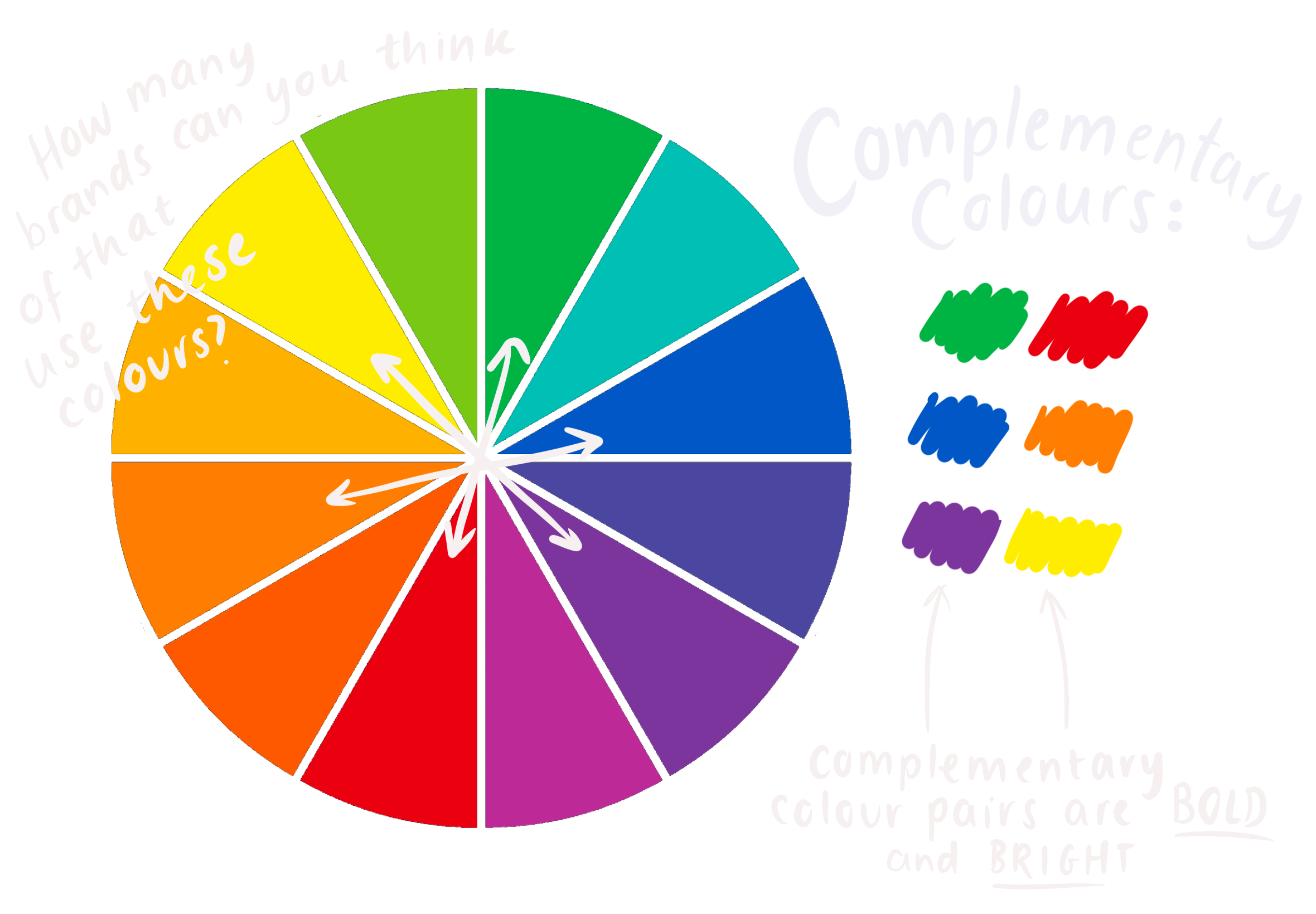
There are many reasons why you might want your digital content to catch attention. For example, YouTube thumbnails or creating an Instagram promotion.
It will always be useful when growing an online audience to think about how these pairs of colours can be subtly introduced to your work.
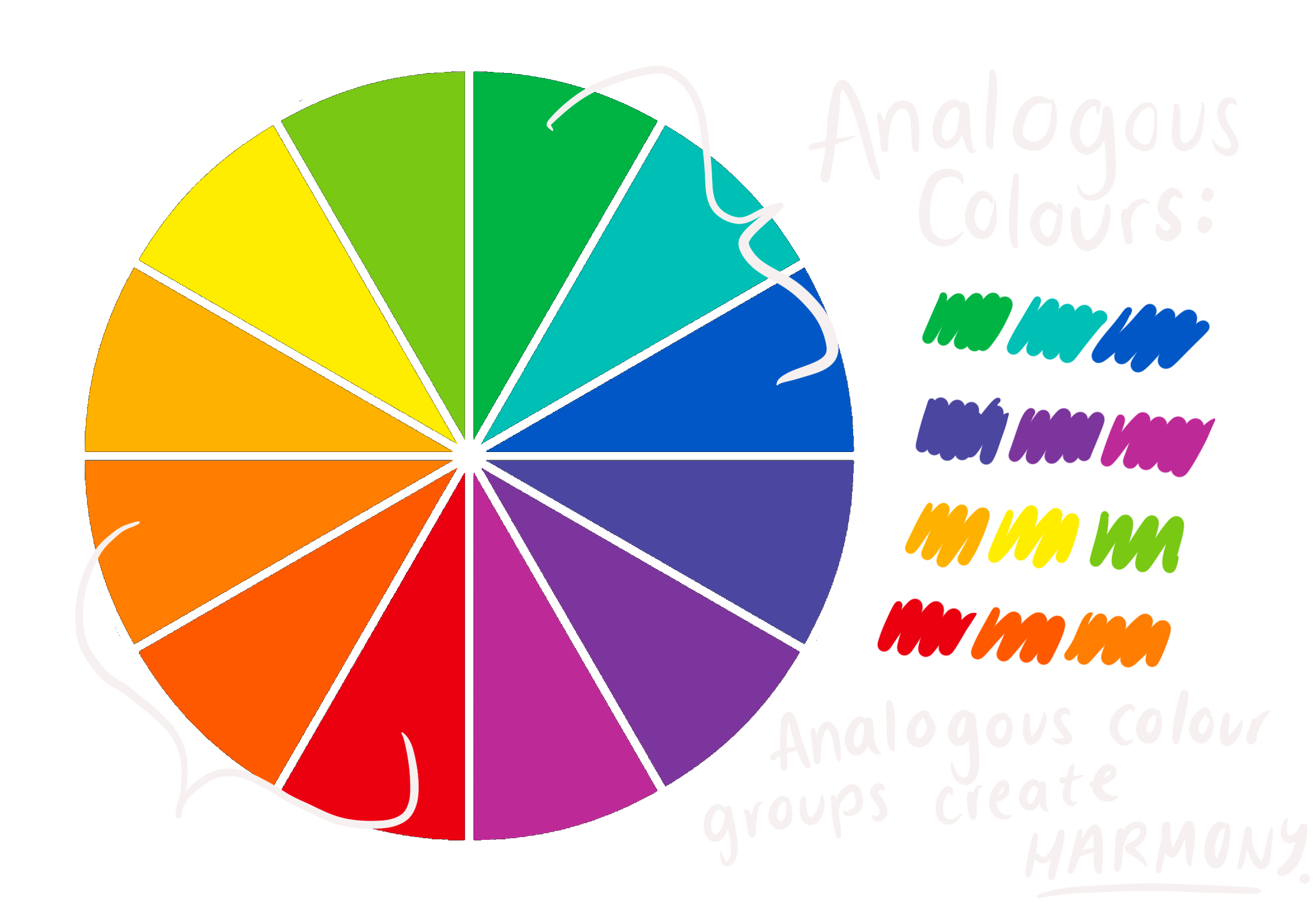
Lastly, let’s look at analogous colours.
There might be instances where you want your viewer to find your content purely aesthetically pleasing and harmonious. The opposite of what you might use complementary colours for.
Analogous colours can make your work look harmonious.
To find analogous colours, you will need to consult your colour wheel again.
Analogous colours are typically a group of 3 colours that are next to each other on the colour wheel.
These groups of colours are likely to create a pleasing visual look displaying completeness. For example, think of the colours in a sunset.
Let’s summarise.
· Identify how you want your audience to engage with your content.
· Consider the colour associations your target audience will have with the colours you use.
· If you want to catch people’s attention, go for those complementary colours.
· If you want to create aesthetically pleasing digital content, think about analogous colours.